Taposé App Review
Taposé was inspired by the fabled Microsoft Courier project. As a reminder, Courier was the phony Microsoft tablet concept that never was. I’ve read many rumors about what happened but the press ate up the vapor-ware because it was a novel concept from Microsoft. In my opinion, all of the excitement was over a cartoon of a concept.
Taposé is the Courier concept except on a shipping device. It’s an iPad app and it was a prominent Kickstarter project.
I’ve used a good number of notepad apps in the past. I’ve reviewed some of the best here. I’m reviewing Taposé in that context. I’m fairly picky about note taking apps so take my comments with a grain of salt.
Long Story Short
I’ve deleted Taposé already. It’s a good first effort by a new development studio but it’s not competitive for the features I care about. I’ll stick with sling Note.
The Concept
In many ways, Taposé is sling Note with a more polished and complicated UI. I’ve written extensively about how useful sling Note is, so I fully expected to like Taposé. Spoiler: I do not.
Taposé is multiple apps in one window. It has a web browser, calculator, address book and map app all living along side a notepad app. In landscape mode two panes can either be viewed in split screen or one pane can be pushed off one edge to focus on one aspect of Taposé .
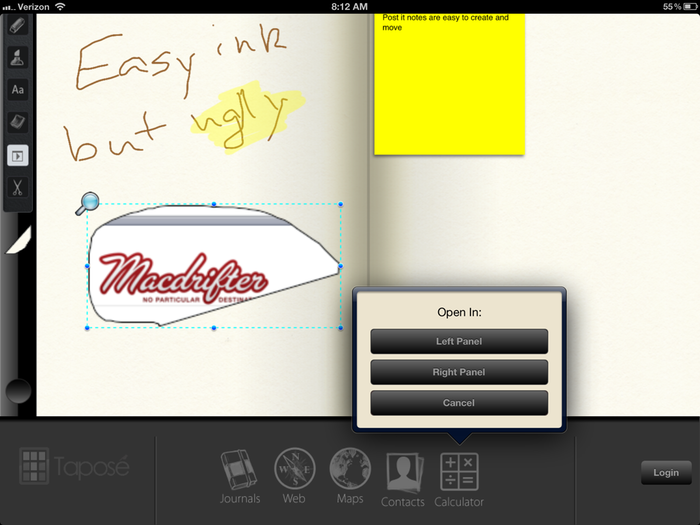
The hook for Taposé is the screen grab tool. An object in a pane can be selected and copied to a visual pasteboard. Pasteboard images can then be dragged out of the pasteboard and onto a note. As I mentioned, this is very similar to sling Note.
The Tools
Taposé is a 1.0 release. It’s easy to see what the developers were thinking this app could be. Unfortunately, it does not hit that goal in my use.
The UI is confusing and sluggish. To switch between dual window and single window mode, a user must hold the side bar at the faux indentation and slide left or right. In contrast, to select the various tools, the user must slide up on the side bar but not on the faux indentation.
I focus on the quality of the ink system in any sketching app. The smoothness of the line and the subtle ink effects are key to good sketching for me. Taposé has a very basic ink line. While it provides easy access to the line controls like color and line thickness, the ink itself is not attractive or enjoyable to use.

Again, the app is hindered by some poor UI choices. For example, the ink format pickers are all in the center of the main window title bar. We all know what iOS 5 added to the very position. Whenever I slightly over reached for the ink color or size, I triggered the Message Center. It happened enough that I became conscious of the action and found myself trying to more precise. That’s an example of the UI interfering with the natural user inclinations rather than disappearing into the experience.
The text entry system is also bewildering. From my testing, it appears that typed text can only be entered starting from the up left corner of the page. There is no option for arbitrary text placement without using the post it note tool.
Taposé gets the post it note right. It’s easy and fast to add a note with text. The notes can be moved and resized after adding as well.
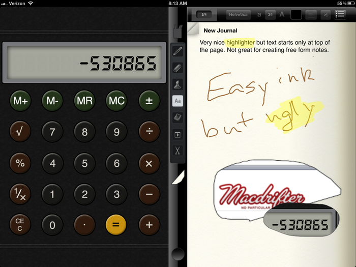
The highlighter may be the best tool in Taposé. The highlighter can be used over any item on a page. The highlighter effect is good looking too. It actually looks like highlighter ink.
Finally, the copy and paste tool, depicted as a pair of scissors, is very nice. The tool uses a free-form selection and virtually anything in the app can be selected and copied to the pasteboard stack. This is also a very nice feature of Taposé. The visual pasteboard adds item to the vertical divider. That means many snapshots can be created and then placed on the notepad in any order. After placing items on the page, they can be resized, moved, deleted and titled. They can not be copied between iOS apps.
The Dual Panes
Other than the awkward UI for accessing the dual pane widgets, Taposé split view works well. Widgets can be placed on either right or left. While the focus of the application is the notepad, the web browser, calculator, maps and address book all perform well.
The calculator is very basic. It feels a little tacked-on though. While if performs like a calculator, I expected a bit more integration with the notebook.
The map integration is all wrong. While it uses the map API in iOS, there is no way to search for a location. That means a lot of pinching and dragging unless I want a map of my current location. Most of the time I do not.
I did find the contacts pane useful. There’s no search function and apparently no access to groups. However, once a contact is located, the contact can be dragged to the visual pasteboard. Dragging the contact to the notebook provides a new context menu.

I have not had a reason to share a notebook but adding a contact card to the notebook page works well. It looks nice and the text is real text that can be selected and copied.
Conclusion
Taposé feels like a 1.0 app. If this was early 2011, it would have met my expectations. But it’s a competitive market for notepad apps now and Taposé is not compelling to me. I’ve already deleted it from my iPad. I’ll check back with the app in a few months to see how it has evolved.