Footnote Marker Styling with CSS

Footnotes
It’s no secret that I like footnotes. I like footnotes on printed material and in eBooks. But footnotes can be awkward on the web.1 While footnotes are not a new concept, it’s still an active debate as to their value and implementation.
I’ve struggled with proper styling of the footnote labels on this site. I want them to be obvious but not distracting. I also want them to look like a footnote mark without screwing up the formatting and reading experience on a large monitor or a mobile device. I want the feel of the printed footnote with the utility of the web.
The problem I have is translating footnotes from the printed page onto the web. There are visual queues on a printed page that there will be footnotes relevant to the material on that page. On the web, a “page” can scroll off the bottom of the browser window. The only indication that there may be tangential but relevant information hiding below the fold, is the footnote marker.
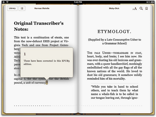
I’m not a fan of how most eBooks are displaying footnote markers. The content is nicely presented, but markers are not as obvious as I would like.

The problem of how to display the footnote content on the web is only partially solved. Dr. Drang has a nice post about his implementation and the lovely Footnotify plugin for Safari. But what’s the solution for iOS? I don’t have one yet, but I have some good ideas now.
I do have a better way to display the footnote markers on Macdrifter, and all it required was getting better at CSS2 and thinking about what I want out of footnote markers.
Styling With CSS
One of my favorite resources for CSS is CSS-Tricks. I also really enjoyed this article at Archiva.net and this more general article at XMLplease.com
As a side note, I really liked just reading the Scholarship on the web article at Archiva.net and pretty much everything at CSS-Tricks.
Paula Petrik at Archiva has wonderful taste and is a great educator. The article on footnotes was worth reading even if I never did any web development. It is chock full of great links about the pros and cons of footnotes and sidenotes. I also love the “sidenote 2” implementation as an alternative to footnotes.
CSS-Tricks is a gorgeous site. The attention to detail makes me hate my own work, but in a good way.
My footnote markers are fairly basic. Here’s the HTML of a typical marker:
:::html
<a href="#fn:bad" rel="footnote">2</a>
So the best handle for the CSS to select is the rel attribute.3 CSS attribute selectors are powerful and well supported. Sure, IE7 has a problem with them, but what doesn’t IE7 suck at? Sitepoint has an excellent description of attribute selectors.4
:::css
a[rel="footnote"] {
    border-bottom: none;
    background-color: #fff9c7;
    line-height: 0;
}
Now that I have a way to select the footnote marker effectively, I can style it a bit. To make the footnote marker a bit obvious, I added a light yellow background. I removed the border-bottom that I use with standard links.
I also adjust the line-height to zero and setting the body text to line-height: 1.25;.5.
:::css
a[rel="footnote"]:before {
    content: "{";
}

a[rel="footnote"]:after {
    content: "}";
}
But footnotes were still too hard to tap on an iOS device.6 To remedy this personal gollum, I’m using CSS' :before and :after selectors to wrap the footnote marker in curly braces.7
I needed to clear the border-bottom attribute on the return link in the footnote text too.

I used a similar strategy as with the markers. Since I may have links in my footnotes I don’t want to arbitrarily clear the underlines in the footnote <div>
Here’s the HTML for a footnote return link:
:::html
<a href="#fnref:refs" rev="footnote" title="Jump back to footnote 1 in the text">↩</a>
Here’s a simple CSS selector that matches it:
:::css
a[rev="footnote"] {
    border-bottom: none;
}
Conclusion
I’m still trying to improve my reading experience on this site. My approach is to focus on one small bit that really annoys me and beat it to death or until I’m sick of it. I don’t know which one of us won this battle.
-
I’ve written too many scientific papers. I love footnotes. I also prefer unabridged books, a good index and director commentaries in movies. ↩︎
-
It’s not hard, since I’m slightly less competent than a standard Mongolian gerbil at CSS. ↩︎
-
Of course I had to look it up. Like I said, I’m not very good at this stuff. ↩︎
-
I also highly recommend the Sitepoint books. The CSS and HTML books are excellent resources. ↩︎
-
A brief discussion of adjusting line height for superscript can be found on a rather old article ↩︎
-
I know I have sausage fingers, but come on, how small do people think an average finger-tip is? ↩︎
-
I’m sure this will be loathed by many. I initially used square brackets, but I look at Markdown too much to be OK with that style. I’m not married to curly braces but we are going steady. ↩︎
