Flatworld
Under the hood, iOS7 appears to be one of the biggest updates Apple has ever released for the iPhone. Unfortunately, the paint job is pretty disappointing to me.
Take a look at these icons:
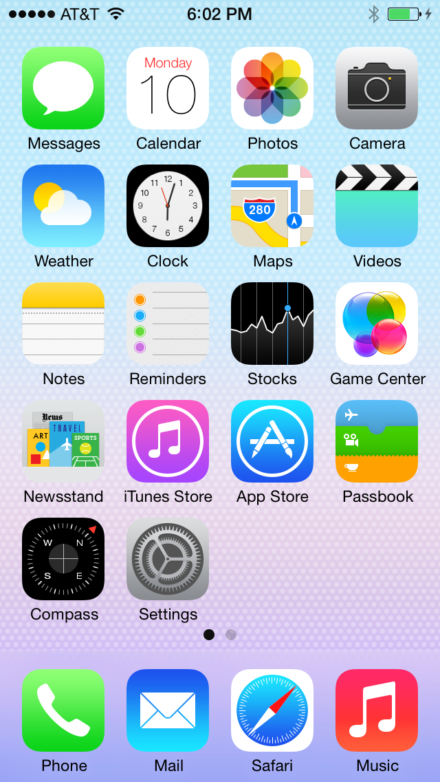
Now ask yourself, seriously, if you were browsing the App Store and came across the Notes, Compass or Weather icons in a list of apps, would you even bother reading the descriptions? Take all of that interface in. Top shadows, no shadows and bottom shadows. They feel like placeholders.
I know I come from a different perspective. I’m from the camp of people that zoom into the TextEdit icon to see what’s written on that tiny sheet of ruled paper. I’ve grown to love those details. They’ve come to signify an unusual attention to craft.
Don’t get me wrong, green felt and leather are not my cup of tea either. Ripped paper on a digital calendar feels comical. But those are extremes I hoped Apple could gracefully back away from. That’s not what I see in iOS7. I see huge technical advancements in iOS7 with a huge step backward in design.
I like what I saw inside the apps and the rest of iOS7. Parallax is nice little trick to demo. The frosted glass effect will be an attractive nuance I look forward to. But, I’m left wondering if the flat icon design exists to emphasize the parallax effect, not because it helps to differentiate apps. But, answer me this, which button in this screenshot is active:

So, I’ll put it on the line prematurely. I think the flat design will cause a huge amount of confusion for new and existing users. I suspect Flat-gate is right around the corner.
I’ll probably regret writing this. I hope I do. This is probably a knee jerk reaction by a backwoods blogger. I’ll probably love it a year from now. But right now, it feels like Apple designed the iOS interface to trick Samsung into copying it.
“Surprise! We were just kidding.”
While I’m excited to use iOS7, I’m just not excited to look at it.